






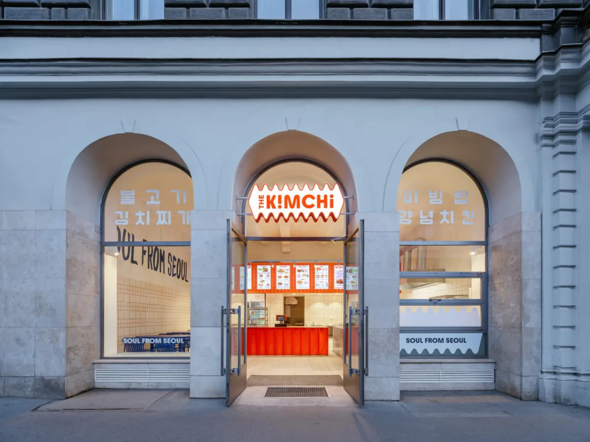
When a husband-and-wife team of Korean restaurateurs set out to bring authentic street food to the heart of the Czech capital, they faced a familiar design challenge: how to honor a rich culinary heritage without falling back on tired visual clichés. Rather than filling a compact commercial space with literal souvenirs, traditional artifacts, or predictable motifs, the architectural firm SOA architekti chose a far more ambitious path. Instead of replicating the physical imagery of Korea, the designers sought to distill the electric visual energy, intense color contrasts, and vibrant graphic culture of contemporary Seoul into a cohesive spatial experience that functions simultaneously as architecture and graphic identity.

Completed in 2026, the newly opened restaurant, named The Kimchi, occupies a 1,453-square-foot footprint situated right beside Prague’s historic Masaryk Railway Station. Taking over what was formerly a neighborhood pastry shop, architects Štefan Šulek and Matěj Štrecha of SOA architekti elected to partially retain the building’s original layout while completely reimagining its interior landscape and street-facing facade. The result is a deeply modern Korean eatery that bridges European urban architecture with the frantic, highly stylized visual language of South Korea’s capital, all tailored specifically to the experiences and backgrounds of the clients.

Reflecting on the overarching vision for the project, Šulek, architect and co-founder of SOA architekti, notes that the primary goal was to embed a distinct cultural identity without relying on surface-level decoration. The team was far more fascinated by the dynamic pulse of modern Seoul—characterized by striking color palettes, bold graphic overlays, and an energetic food culture—than by passive postcard imagery. This philosophy guided every stage of the design process, ensuring that the restaurant’s physical environment would speak the same language as the street food served across its counters.

This sophisticated approach is most clearly visible in the establishment’s defining spatial gesture: a fluid, dynamic wave that originates on the exterior signage, flows seamlessly onto the serving counter, and ripples across the interior walls. Developed in close collaboration with graphic designer Tomáš Eisner, this organic form began as a loose, abstract interpretation of the traditional taegeuk symbol found at the center of the South Korean flag before evolving into a more fluid and contemporary geometric motif. In a space as compact as a 1,453-square-foot former pastry shop, introducing a single, powerful unifying gesture that ties the architecture directly to the graphic identity proved far more effective than cluttering the room with a multitude of competing decorative elements.

Color acts as another primary driver of the interior design, orchestrating the visitor’s journey through the narrow establishment. A striking shade of blue stretches across custom tables, built-in bench seating, specific wall finishes, and subtle lighting details, creating a cool, stabilizing contrast against the warmer elements of the room. Meanwhile, an unexpected application of red grout transforms a grid of otherwise ordinary, budget-friendly white ceramic tiles into a highly sophisticated graphic surface. This clever detail bridges the gap between raw industrial utility and high-end graphic design.

While the red grout might initially appear to be a modest, almost insignificant design choice, Šulek emphasizes its critical role in defining the overall atmosphere. By utilizing an inexpensive and nearly generic construction material, the architects managed to fundamentally alter how the tiled surfaces are perceived by diners. The everyday grid suddenly transforms into an active, graphic element that visually connects with the various red accents distributed throughout the rest of the restaurant.

Crucially, this seamless overlap between two-dimensional graphic design and three-dimensional physical space was established right from the very beginning of the project. Branding was never treated as an afterthought or slapped onto the walls after construction wrapped up; instead, it was developed concurrently with the architectural blueprints. SOA architekti worked hand-in-hand with Eisner and the restaurant owners to orchestrate materials, bespoke colors, exterior and interior signage, and the core brand identity as a single, unified entity. The prominent wave motif emerged directly from this collaborative exchange, moving effortlessly between a flat graphic mark on paper and a tangible, three-dimensional architectural form.

The tight footprint of the former pastry shop also necessitated operational efficiency, turning the mechanics of food preparation into an integral part of the interior experience. To maximize the usable dining area, much of the heavy food preparation is intentionally kept out of sight, while the final stages of cooking and assembly take place right at the main counter. This open setup allows guests to watch their meals being finished in real time, adding a theatrical and personal element to the dining experience. Despite the spatial limitations, the seating arrangements offer surprising variety, ranging from intimate window perches and a continuous wall bench to individual dining tables and a commanding communal concrete table designed to foster a sense of shared community.

These pragmatic design decisions ensure that the bold visual concept never overwhelms the restaurant’s primary culinary purpose. While The Kimchi certainly draws heavily on the colors, graphics, and kinetic energy associated with contemporary Seoul, its authentic Korean identity does not rely on any single, easily recognizable symbol or tourist trope. Instead, architecture, graphic design, and the daily rituals of preparing and sharing food collaborate naturally to tell a deeper, more authentic story in the heart of Prague.