


When it comes to gathering high-fashion styling inspiration, nothing quite matches the unfiltered creativity of the runway. Beyond previewing the statement bags we will eagerly carry throughout the upcoming seasons or reimagining how to style our tried-and-true sweaters, the collections serve as an ongoing laboratory for color theory. Designers continually challenge traditional aesthetics by introducing unexpected pairings that somehow feel entirely intuitive once they hit the catwalk. The Spring/Summer 2027 runways delivered a profound masterclass in this exact phenomenon, with influential houses like Tory Burch, Tibi, and Ulla Johnson demonstrating how color can be manipulated to entirely redefine a silhouette.
Model after model, these designers delighted audiences with combinations that traditional styling rules might dictate shouldn’t work together, yet on the runway, they really did. While these collections were technically conceptualized and showcased for the warmer weather months of the upcoming year, the brilliant color combinations introduced do not need to wait for a seasonal shift. They can be integrated into your everyday wardrobe immediately, bridging the gap between current wear and future trends. The overarching philosophy from the front rows and backstage stylists is simple: do not shy away from color combinations you have never tried before. Often, the most jarring initial juxtapositions evolve into your most reliable and celebrated go-to outfits.
Red & Purple
One of the most fascinating developments across multiple designer showcases was the unexpected elevation of red as a neutral baseline. Rather than serving strictly as a loud, standalone statement piece, red was treated with a remarkable level of versatility, anchoring outfits in a way that typically reserved for navy, black, or beige.
This approach was prominently on display during the Tory Burch Spring/Summer 2027 show. Burch utilized a striking red skirt as the foundational element of the look, anchoring the lower half of the silhouette with a vibrant energy. Rather than pairing it with a muted or expected neutral top, the design house opted for a rich, deep purple blouse. The resulting collision of these two saturated, warm-adjacent tones created a luxurious, deeply sophisticated depth that proved crimson and violet are natural partners when handled with the right texture and proportion.
Red & Mustard Yellow
Continuing the unexpected crusade of red as a flexible styling tool, designer Amy Smilovic integrated the bold hue into the Tibi Spring/Summer 2027 collection with a similarly fearless approach. Known for her sophisticated, wearable take on modern minimalism, Smilovic pushed traditional boundaries by styling a striking red garment alongside a breezy, relaxed mustard yellow blouse.
The combination bridged the gap between fiery warmth and earthy grounding. Mustard yellow, with its subdued, golden undertones, managed to temper the intensity of the red without muting its impact. The ensemble offered a masterclass in contrasting warm tones, proving that two inherently loud colors can balance one another out when executed through effortless, fluid silhouettes.
Red & Blue
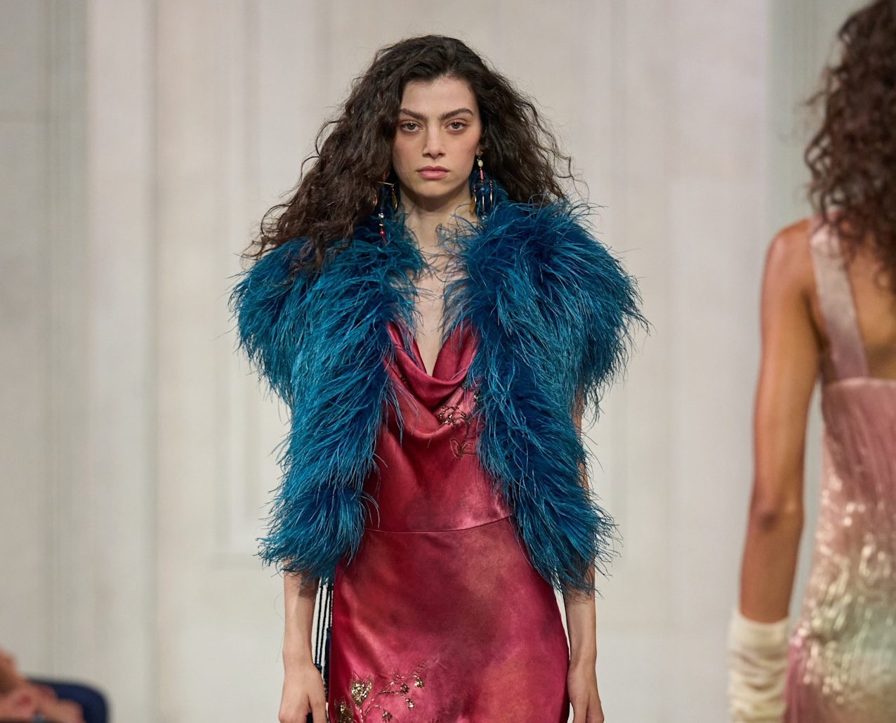
Primary colors have an innate, undeniable affinity for one another—it is a foundational rule of art and design. However, pairing red and blue together in clothing can occasionally risk feeling a bit too literal, evoke predictable nautical or patriotic tropes, or simply read as "too on the nose" for modern high fashion.
On the Ralph Lauren Spring/Summer 2027 runway, however, this classic primary pairing was completely reinvented and given a radically fresh, contemporary twist. Instead of relying on standard primary hues, Ralph Lauren utilized a delicate, sophisticated pinky-red silk paired against a high-impact, neon blue fur garment. The juxtaposition of the glossy, delicate silk with the rich, textured volume of the neon blue fur elevated the classic red-and-blue pairing into an avant-garde statement that felt entirely fresh, luxurious, and visually arresting.
Pastel Pink & Mustard
Moving away from high-contrast primary and secondary color clashes, other designers explored the delicate interplay between soft pastels and rich, grounded earthy tones. At Ulla Johnson, a particularly compelling workwear-inspired ensemble captured the attention of attendees and street-style photographers alike, proving that professional silhouettes do not have to rely on traditional corporate palettes.
The underlying structure of the look utilized very familiar, classic workwear silhouettes—specifically a crisp button-down shirt paired with tailored trousers. However, the choice of colors completely transformed the garments. By pairing a soft, romantic pastel pink with a deep, earthy mustard yellow, the outfit crossed into territory that felt both exciting and entirely unmissable. The gentleness of the pink offset the heaviness of the mustard, creating a harmonious balance that felt sophisticated yet playful.
Cobalt Blue & Lemon Yellow
The theme of invigorating darker, saturated shades with sharp, playful contrasts continued over at TWP. On the brand’s Spring/Summer 2027 runway, a striking combination of deep cobalt blue and highlighter yellow immediately caught the eye of fashion critics.
The pairing served as a visual reminder of how to successfully manipulate color blocking without overwhelming the wearer. By placing a vibrant, high-energy lemon or highlighter yellow element directly against the deep, resonant richness of cobalt blue, the outfit gained an instant sense of motion and vitality. It provided an accessible blueprint for anyone looking to brighten up darker, heavier wardrobe staples by introducing a playful, high-contrast layer on top.
Lemon Yellow & Olive Green
When styling a particularly bold and radiant hue like lemon yellow, the instinctive reaction is often to tone down the rest of the outfit. Traditional styling advice might suggest pairing a loud yellow piece with simple, unobtrusive neutrals like black, white, or gray to let the color speak for itself. Brandon Maxwell, however, emphatically proved otherwise.
Instead of keeping the surrounding pieces simple or safe, the Brandon Maxwell Spring/Summer 2027 collection added unexpected depth to lemon yellow by pairing it directly with rich olive green. This combination defied conventional color theory expectations; rather than clashing, the muted, earthy undertones of the olive green provided a sophisticated anchor for the bright, solar energy of the lemon yellow. The result was a sophisticated, grounded ensemble that felt both high-fashion and surprisingly wearable.
Pink & Tan
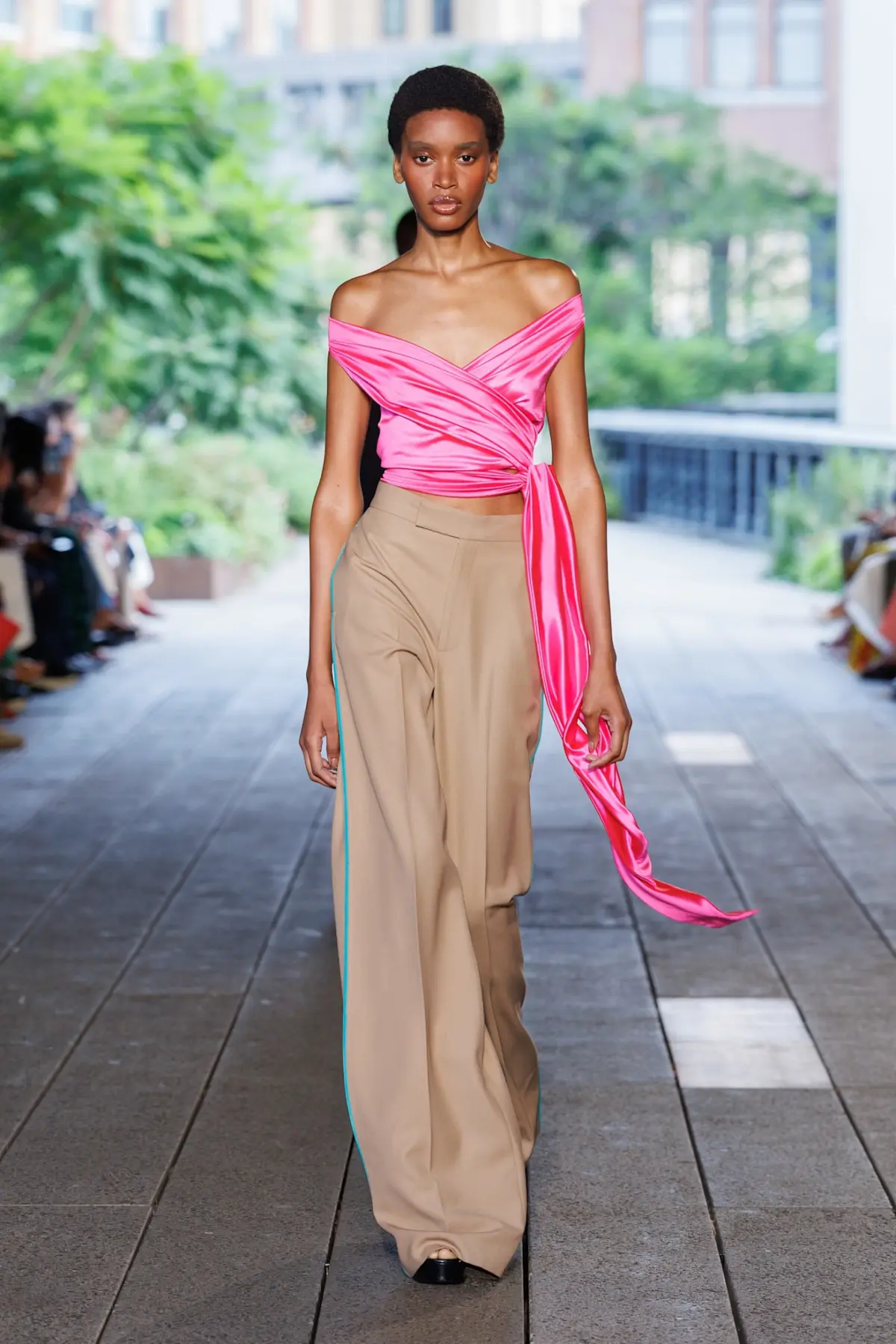
Neutral color palettes like tan-on-tan ensembles remain a perennially chic, timeless choice for transitional dressing. However, relying exclusively on monochrome neutrals can occasionally veer into monotony. The Spring/Summer 2027 collections demonstrated how easily those foundational wardrobe staples—such as classic tan trousers—can be re-energized through unexpected color injection.
On the Diane Von Furstenberg runway, classic tan pieces were given a much more playful, vibrant life when paired with bold pink tops. This combination allows the wearer to stand out and embrace expressive color without feeling overly theatrical or garish. Because the tan serves as a steadfast, neutral base, it grounds the high-energy femininity of the pink, making the overall look approachable, balanced, and effortlessly chic.
Green & Plum
As designers looked toward the deeper, more introspective end of the color spectrum, rich jewel tones took center stage. A standout plum-and-green look from Tory Burch offered an immediate addition to autumn moodboards and transitional styling lists.
The pairing hinges on the seasonal appropriateness of a rich, velvety plum hue, which naturally evokes feelings of warmth and depth. By introducing an unexpected splash of green, the outfit gained an extra dimension of visual interest. The green provided an invigorating contrast to the darkness of the plum, adding the exact right amount of punch to elevate the look from standard seasonal wear into a true masterclass in advanced color pairing.