





Color has never existed in a vacuum. It is deeply contextual, shifting in perception depending on the surface it occupies and the hues that surround it. A rich red on supple leather, for instance, does not read the exact same way as that exact same shade rendered on soft cashmere. The same principle applies to color combinations: a literal shade remains unchanged, yet how the human eye perceives it alters drastically based on its neighbor. A vibrant yellow pops with electrifying intensity when contrasted against a deep purple, but that very same shade of yellow can instantly transform into something soft, warm, and inviting when paired with a gentle cream.
This fluidity of perception sits at the heart of the latest forecasting insights from Future Snoops, the trend forecasting agency formerly known as Fashion Snoops that advises global brands on culturally relevant aesthetics. On Thursday, the agency hosted an exclusive webinar to announce its comprehensive color forecasts for the fall/winter season of 2028-2029. The timing of the presentation preceded the scheduled launch of FS Color Intelligence, a new artificial intelligence-powered platform built on Future Snoops’ extensive repository of color palette expertise. While specific operational details of the AI tool were kept under wraps during the session, Joanne Thomas, director of color at Future Snoops, explained that the technology is designed to help brands navigate and make sense of an increasingly complex landscape of color.
“So much of what we talked about today comes down to the idea that a color is never just one color. It changes so much depending on what sits next to it,” Thomas told attendees during the webinar.
During the presentation, Future Snoops outlined three of its five core "color shifts"—seasonal palettes united by overarching cultural themes that reflect the mood, anxieties, and aspirations of the contemporary consumer. By examining how societal shifts translate into visual cues, the forecasting agency provided a roadmap for how designers and brands can approach upcoming collections with emotional and aesthetic resonance.

Blocked Brights
The first major color shift introduced by the agency is titled Blocked Brights. Hallie Spradlin, director of visionary at Future Snoops, described this palette as a collection of tones that deliver a hard and unapologetic edge, while remaining firmly grounded through cohesive underlying threads. This sharp aesthetic direction draws inspiration from a variety of contemporary cultural signals, including artistic expressions of defiance against modern socioeconomic structures.
Spradlin pointed specifically to filmmaker Boots Riley’s vibrant anti-capitalist movie, “I Love Boosters.” The film, which stars Keke Palmer, utilizes bold and monochromatic color blocking as a visual rebellion against a homogenized, highly capitalistic system. By leveraging striking color contrasts, the film communicates a sense of disruption that directly mirrors the conceptual framework of the Blocked Brights shift.
At the center of this palette is its designated anchor color: cornflower. Future Snoops has flagged this specific shade of blue as a must-have hue for the season because it feels bright without ever crossing into a territory that feels overly sharp or abrasive. As a familiar and widely accepted shade of blue, it provides consumers and designers with a psychological safety net, granting them the courage to experiment with the unknown.
“As one of the most trusted and universally worn hues, it gives the palette palette permission to take risks elsewhere,” Spradlin explained. She noted that it is precisely the stabilizing presence of cornflower that allows pairings with a fiery red called poppy and a bold shade of purple called ultraviolet to read as confident rather than chaotic.
Pink Standard
Moving away from the stark disruptions of the first palette, the second color shift, dubbed Pink Standard, introduces a softer yet profoundly resilient emotional resonance. According to Spradlin, this palette carries care and empathy inherently, avoiding any need for performative gestures or apologetic framing. Eschewing artificiality, this particular color shift feels remarkably authentic to the current cultural moment.

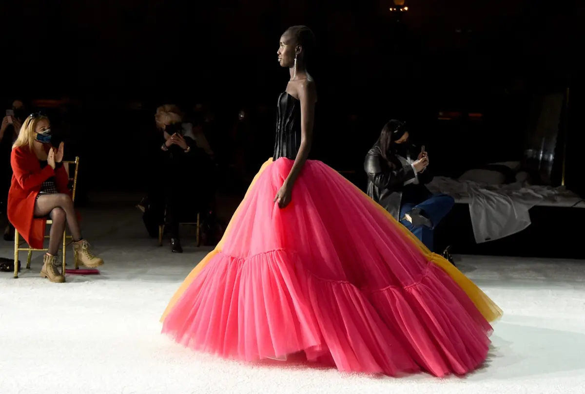
The evolution of pink in recent years provides vital context for this shift. Long gone are the days when pink was narrowly pigeonholed; instead, society has redefined the color as a symbol of quiet strength. It represents a deliberate, conscious choice to embrace softness in a world that often feels fast-paced and callous. From men incorporating pink into their wardrobes to push back against the rigid constraints of toxic masculinity, to women utilizing the shade to reject unrealistic and punishing body standards, pink has steadily transformed into a color of defiant empathy.
At its core, this shift represents a refusal to harden for the sake of survival or to shrink to accommodate others. In an emotionally heavy global climate, choosing softness functions as a quiet act of profound strength.
“So a color that’s once coded as delicate, decorative, or even gendered, now settles in everywhere, in a room, on a shelf, on a body, or folded into anyone’s everyday palette,” Spradlin noted, emphasizing its ubiquitous yet impactful nature. “But its ease hasn’t dulled its pull, and pink still catches the eye faster than almost any other color. It’s quite enough to be a true neutral, but still magnetic enough to lead. This whole shift is pink without nothing left to prove.”
The designated anchor hue for the Pink Standard shift is rose hip, a nuanced shade of pink that Future Snoops highlights as entirely distinct from its chromatic peers. While the majority of pink tones tend to either whisper quietly or shout for attention, rose hip achieves neither, maintaining a steadfast presence that holds its ground across various applications.
Marinated Tones
The third and final color shift detailed during the webinar centers on green and is titled Marinated Tones. This palette reflects a deliberate embrace of slowness, functioning simultaneously as a conscious lifestyle choice and a deeply lived-in experience.

“This is color that’s given time to steep and settle into itself. Nothing here is rushed. Everything is built slowly, the way heritage craft takes years to master, or flavor that deepens the longer that’s left to sit,” Spradlin said.
This conceptual direction draws direct inspiration from traditions of fine craftsmanship and archival preservation. The agency highlighted the ways in which physical media and tangible objects have begun to regain cultural relevance during an era where digital taste has become infinitely scrollable and inherently disposable.
Reflecting this appreciation for patience and depth, the anchor color for the Marinated Tones shift is pickled fennel, characterized by the agency as a color that embodies the virtue of waiting.
“The pickle fennel comes from marinated mid tones, which celebrates hues given time to deepen, steep, and settle. It carries the ease of olive and mustard tones that have anchored palettes for many, many seasons,” Thomas concluded.