




By Nora Sullivan
October 12, 2026
MINNEAPOLIS — When couples in the Midwest begin planning their dream weddings, the prevailing design instincts often draw them toward subdued, neutral color palettes. Muted earth tones, minimalist aesthetics, and understated elegance have dominated regional celebrations for years. However, a recent editorial showcase hosted at the Hutton House in Minnesota is challenging those conventions, encouraging soon-to-be-married couples to break away from traditional expectations and embrace a world of vivid color, dynamic patterns, and tactile textures.
The creative team behind the striking event set out to prove that bold design choices are not something to be feared. Instead, they looked southward for their primary source of inspiration: the effortless, sun-soaked energy of a Miami summer pool party. By translating those tropical, high-energy vibes into a Midwestern setting, the designers crafted an atmosphere that successfully balanced a playful spirit with an elevated, sophisticated aesthetic. The resulting celebration serves as a masterclass in how to infuse personality, vibrancy, and unexpected visual elements into a high-end wedding environment without losing a sense of refined elegance.
At the heart of this design philosophy was a deliberate departure from the ordinary. The conceptualizers behind the event wanted to challenge couples to think outside the box, demonstrating that color and pattern, when handled with intentionality, can create a deeply memorable experience. Rather than relying on safe, monochromatic schemes, the team utilized an abundance of pattern and texture across every facet of the production, resulting in a cohesive environment that felt both lively and luxurious.
Choosing the right location was critical to bringing this vibrant vision to life. The team selected the Hutton House, a venue renowned for its pristine, all-white architecture and clean lines. Rather than fighting the stark backdrop, the designers used it as a blank canvas, allowing the explosion of color and pattern to truly pop against the neutral surroundings. Furthermore, the venue provided the ideal setting for an outdoor reception setup. By taking the celebration outside, the team was able to celebrate and showcase the brilliant summer sun—a precious commodity in Minnesota, where residents wait eagerly through long, freezing months for the warmth of the summer season.
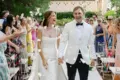
While the overarching design relied heavily on bright hues and dynamic patterns, the bridal fashion introduced a layer of classic romance and refined sophistication. The featured wedding gown showcased a stunning drop-waisted silhouette, a timeless yet modern cut that immediately commanded attention. The dress was further elevated by delicate, intricate floral details that cascaded across the fabric, bridging the gap between the structured fashion and the organic, botanical elements of the decor. To complete the look, the bride was adorned with exquisite diamonds sourced from a local Minnesota jeweler. This thoughtful pairing not only supported regional craftsmanship but also added a brilliant, sparkling wow factor that anchored the high-fashion ensemble.
The true tour de force of the event, however, lived within the meticulously curated details of the florals, decor, and tabletop design. Color, texture, and pattern served as the absolute core of the design narrative, dictating everything from the ceremony platform to the intimate dining tables.
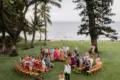
For the ceremony, the traditional altar was reimagined entirely. Instead of standard floral arrangements or simple arches, the platform was covered in bright, overflowing mounds of a wide variety of roses. This dense installation created a lush, colorful foundation that framed the couple against the crisp white backdrop of the venue.
Moving into the reception space, the tablescape emerged as a defining highlight of the entire design. The styling was layered in every sense of the word, embodying a maximalist approach that felt intentional rather than chaotic. The designers embraced a philosophy of color on color and pattern on pattern, blending elements that might traditionally clash into a harmonious and visually arresting composition.
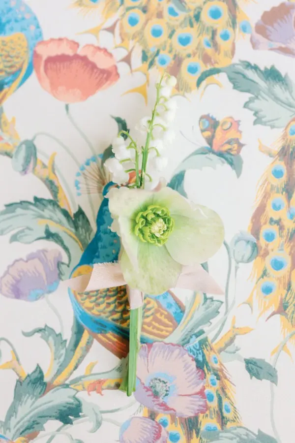
To introduce movement and a sense of seasonal joy, the floral arrangements incorporated a mix of spring favorites, including bright tulips, cheerful daffodils, and delicate hellebore. These blooms were described as bright and juicy, offering a lively contrast when paired directly alongside organic rattan lamps. This juxtaposition of natural textures and vibrant floral tones underscored the playful yet elevated design brief. Further contributing to the eclectic and inviting atmosphere was a bold yellow-and-white striped lounge area, offering guests a comfortable and visually striking space to relax during the festivities.
When reflecting on the success of the event, the design team pointed directly to the layered tablescape as their ultimate favorite element. The interplay of bright colors, contrasting patterns, and rich textures created a visual depth that continued to reward closer inspection. Beyond the physical decor, the event’s stationery suite played a pivotal role in establishing the mood. Featuring a mix of bold stripes, a striking peacock pattern, and custom-shaped paper goods, the stationery introduced another layer of personality that carried through from the initial invitations to the day-of menus and signage.
For couples looking to pull off a similarly vibrant aesthetic for their own celebrations, the primary takeaway is rooted in seasonal awareness and confidence. The designers emphasize that you can never truly go wrong when you lean directly into seasonal cues and fully embrace a palette of vibrant colors. By casting aside the hesitation that often accompanies bold design choices, couples have the opportunity to create a deeply personalized wedding day that leaves a lasting impression on their guests long after the music fades.