




As the transition from summer’s bright palettes and unusually warm autumn days gives way to genuine cold-weather dressing, fashion enthusiasts face the annual challenge of updating their seasonal wardrobes. While foundational staples like white tank tops and black linen trousers easily dominate the warmer months, winter provides a distinct opportunity to reintroduce rich, heavy hues through knitwear, outerwear, and accessories. To map out the shifting landscape of cold-weather style, a lively debate among fashion editors has highlighted the contrasting viewpoints and subjective tastes shaping the industry’s direction.
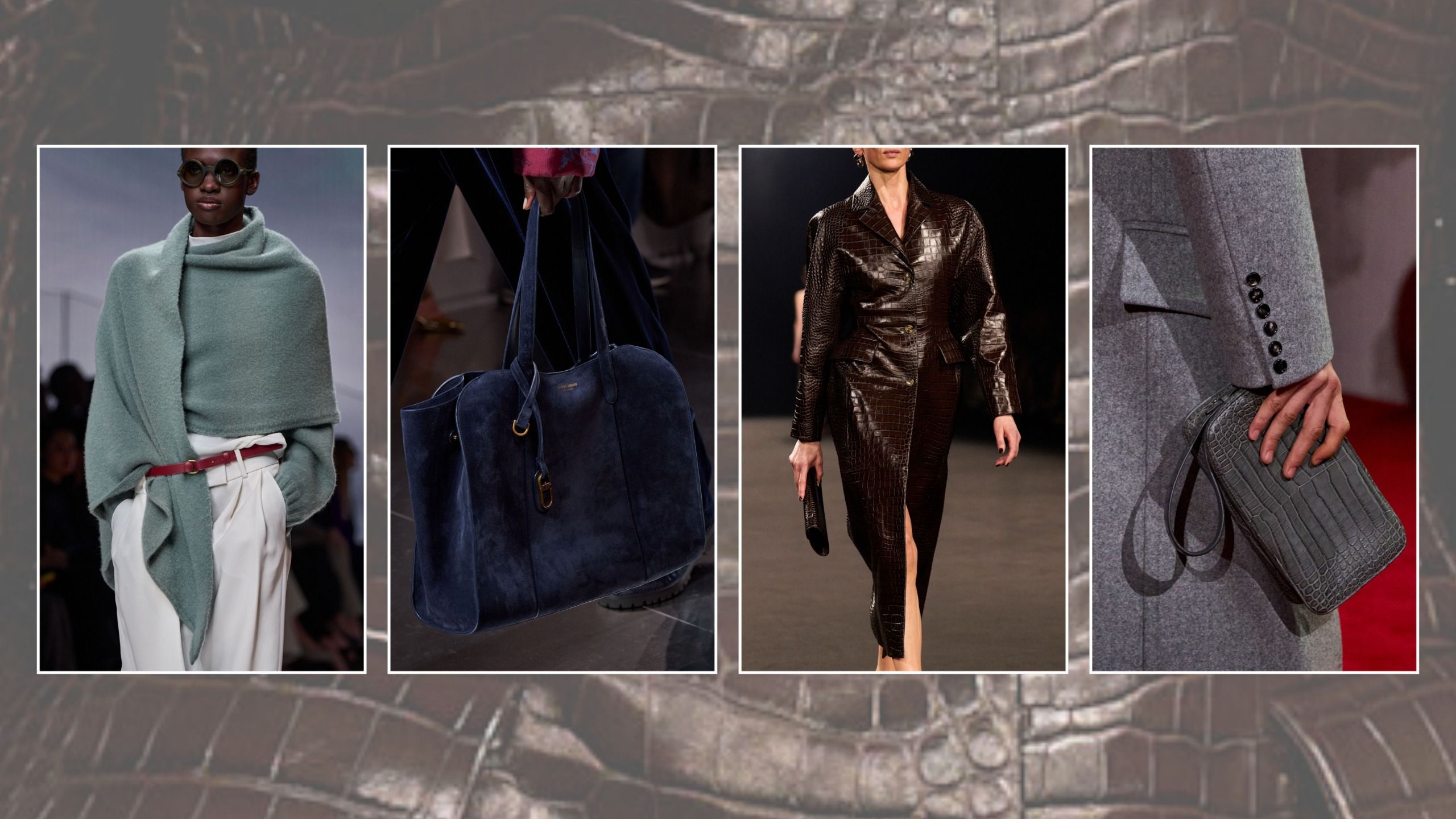
While no single color is ever truly dated—and personal preference should always outweigh fleeting trends—the autumn/winter 2026 runways made it clear that color is doing the heavy lifting for cold-weather fashion this year. Designers across major global fashion houses have placed a heavy emphasis on distinct tonal palettes. However, an internal office debate revealed that fashion is wholly subjective, with one editor actively swearing off a shade that another has declared an absolute must-wear for the year. Rather than acting as a rigid prescription, these choices reflect individual taste, offering a broad spectrum of inspiration for anyone looking to refresh their wardrobe.
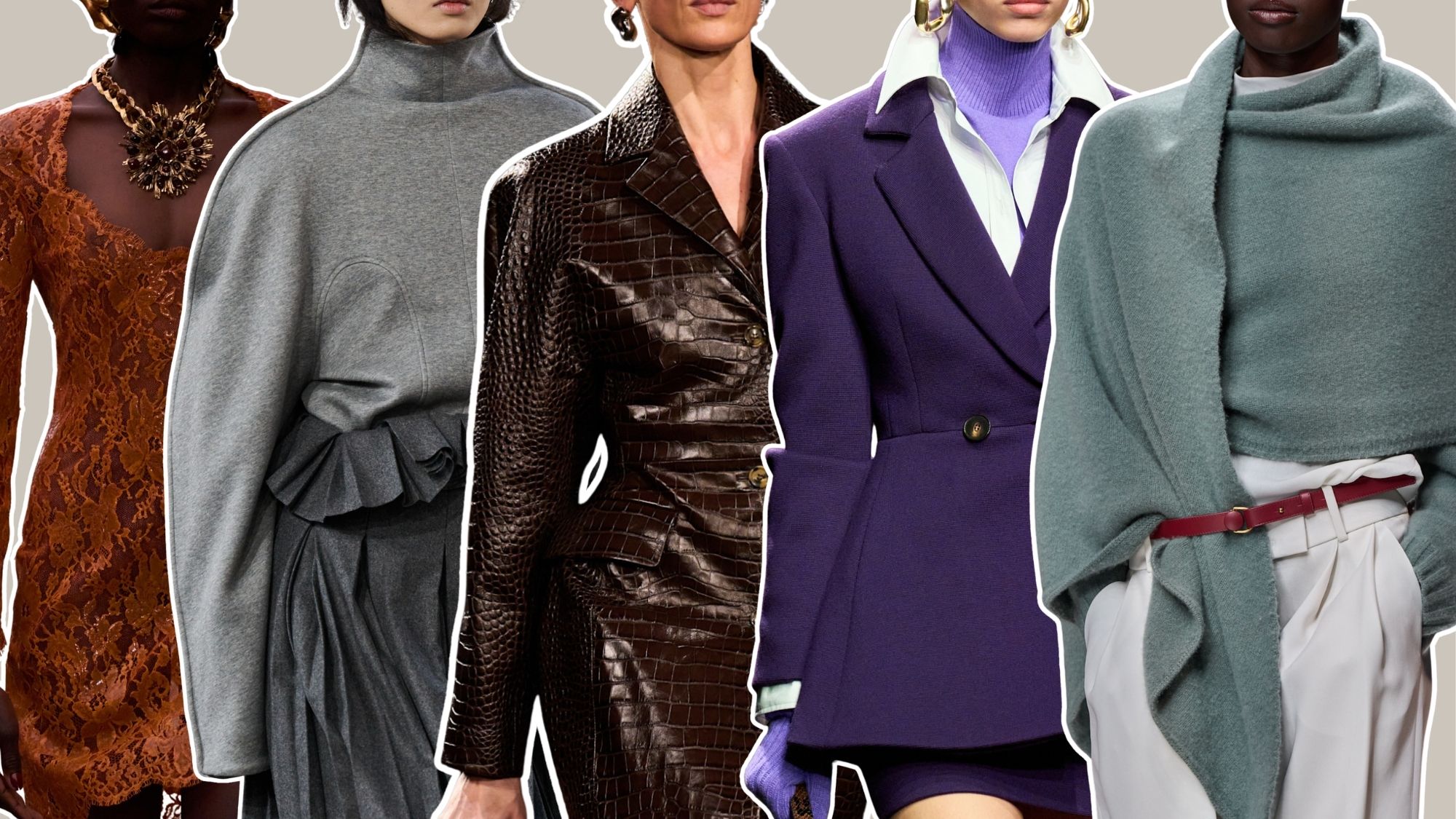
6 Colors That Feel Dated for Winter 2026, Plus 6 That Don’t
The overarching discussion centers around six prominent color pairings where editors are intentionally choosing to pause one trend in favor of another.
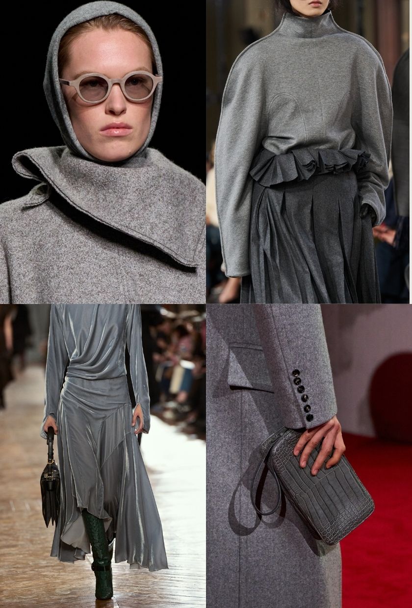
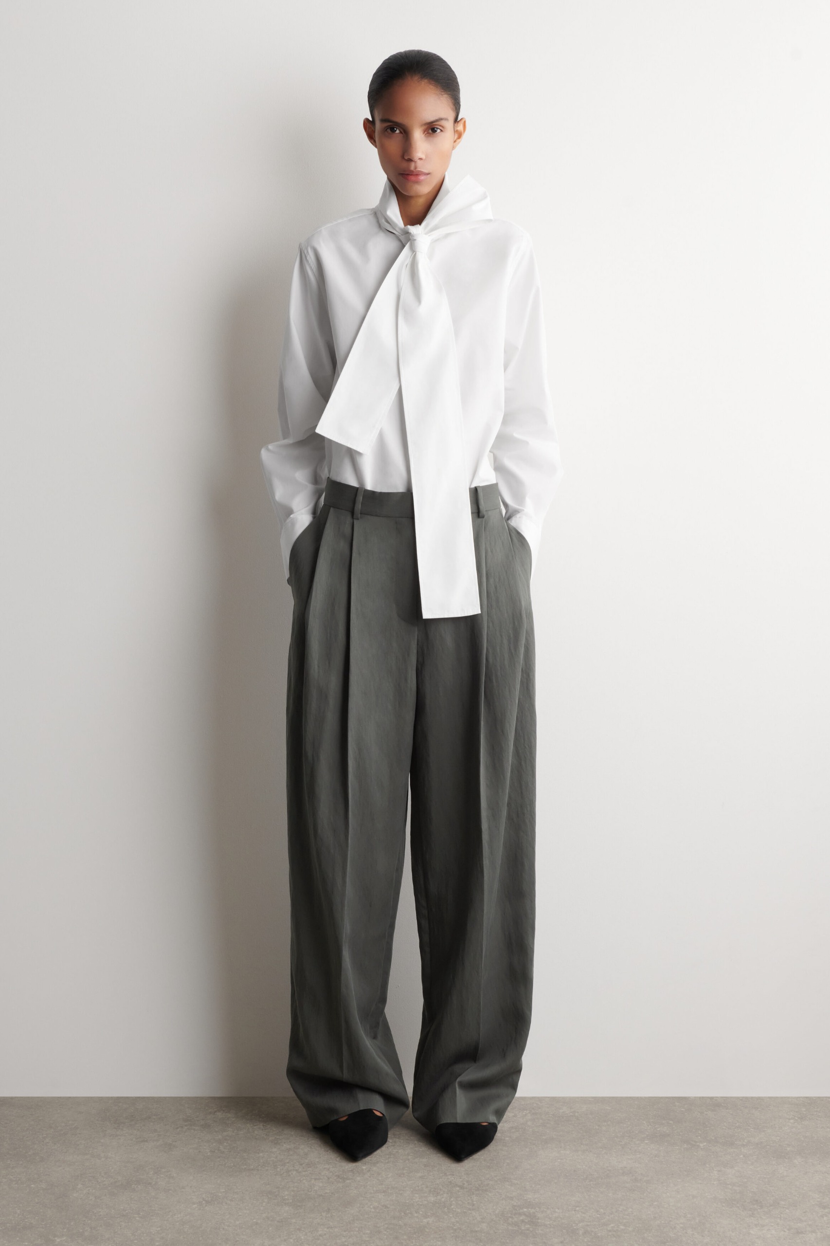
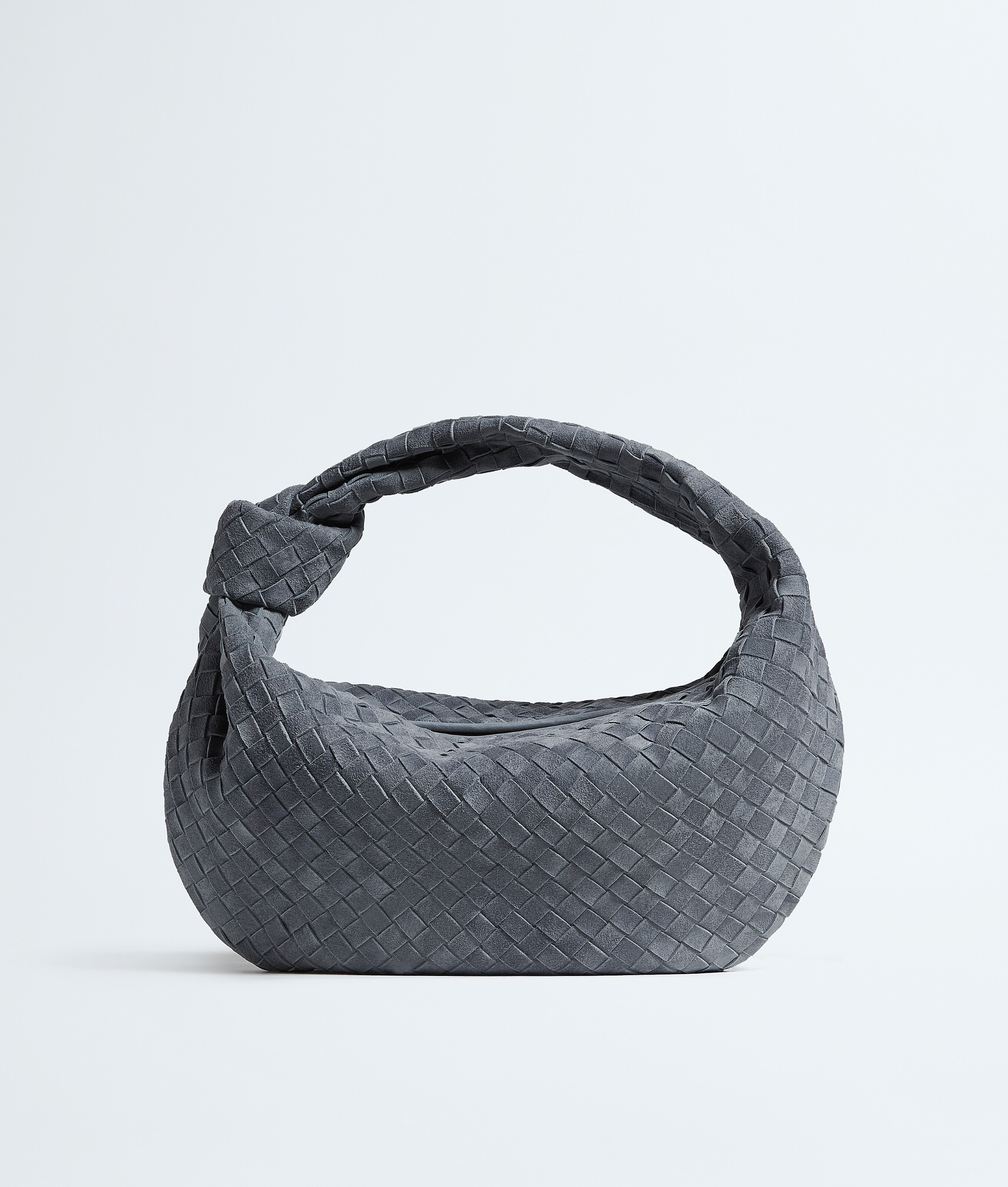
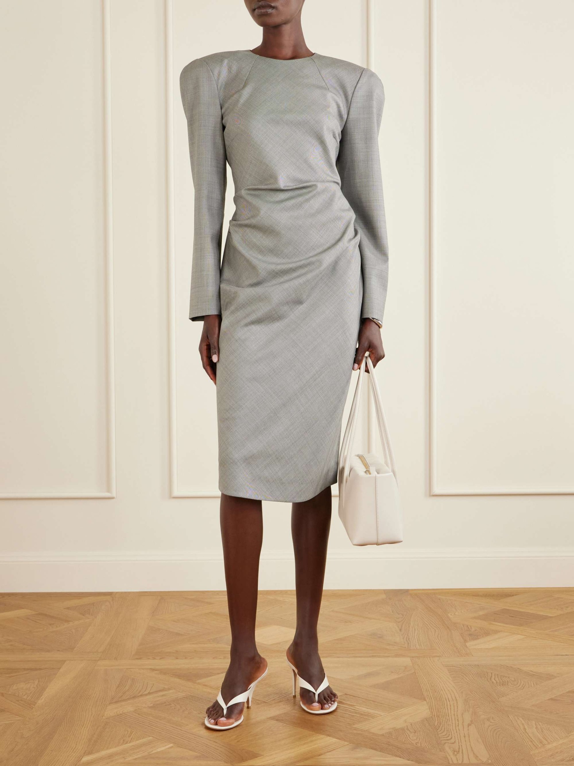
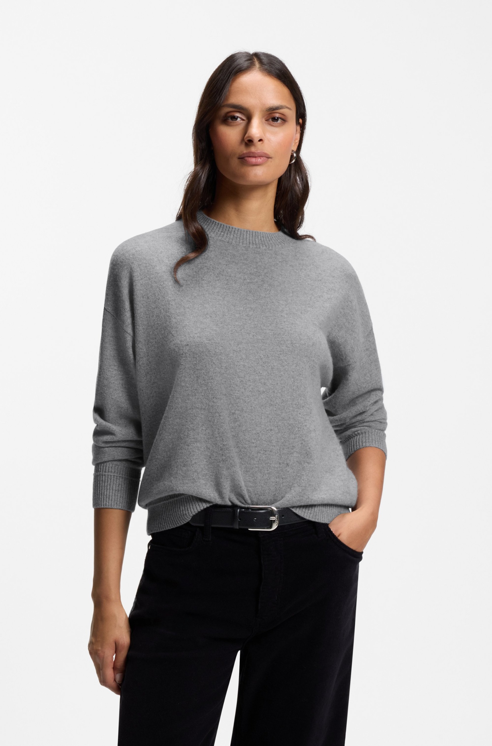
Wearing: Slate | Pausing: Teal
Reflecting on the warmer months, the teals and turquoises that defined summer are stepping aside for something more subdued. Brittany Davy, a junior fashion and beauty writer, notes a desire for a more grown-up aesthetic as winter approaches. "Slate grey feels polished and yet very cool for the colder months and also remains just as versatile as any other neutral hue," Davy explains. Backed by runway presentations from Bottega Veneta, Issey Miyake, and Lanvin, the shade offers a sophisticated alternative to brighter aquatic tones, paving the way for full monochrome grey ensembles, affectionately dubbed "groutfits."
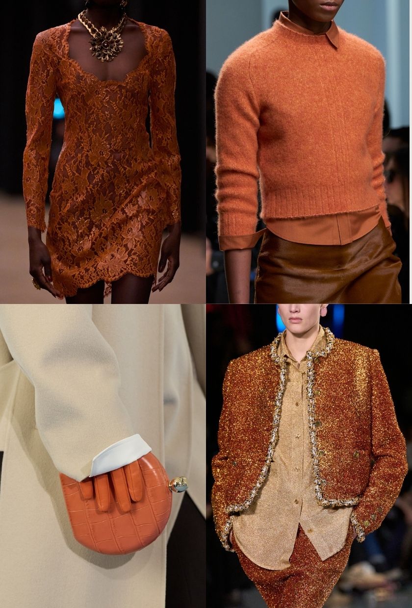
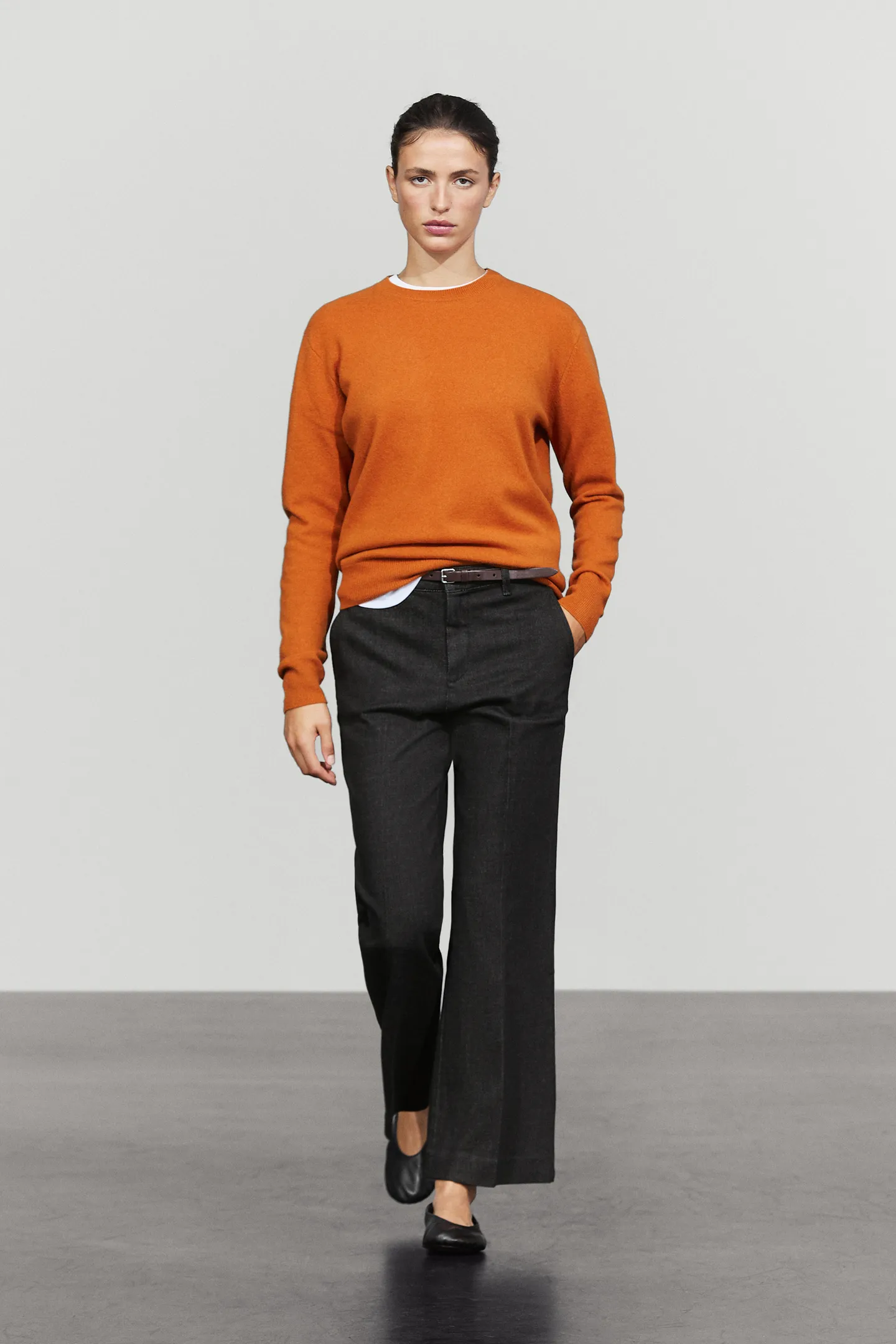
Wearing: Pumpkin | Pausing: Burgundy
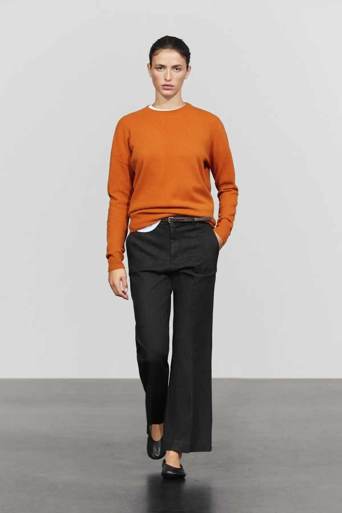
In the realm of rich, warm tones, burgundy and deep wine colors have enjoyed a massive multi-season run. However, fashion writer Ava Gilchrist is choosing to bypass the shade this winter. "As much as I love a glass of Chianti when the weather drops, wearing wine tones is a different story entirely," says Gilchrist. Instead, she is gravitating toward piquant oranges. Drawing inspiration from recent cultural touchstones and the autumnal association with squash-inspired hues, winter wardrobes are welcoming tangerine satin shirts and clementine-colored accessories as a vibrant alternative.
Wearing: Espresso | Pausing: Plum
Navigating the spectrum of purples and browns brings up another sharp divergence in editor preferences. Editor Maxine Eggenberger acknowledges the presence of bright purples in current street style and runway collections but draws the line at plum. Opting out of darker muted purples entirely, Eggenberger prefers to stick to rich, luxurious browns. These deep espresso tones provide a reliable, understated foundation that aligns with a minimalist aesthetic without relying on the heavier, somber undertones of plum.
Wearing: Sea Glass | Pausing: Red
Cherry red has established itself as a near-neutral staple among fashion editors over recent years, but for minimalists, the bold hue can sometimes feel overpowering. Shopping editor Florrie Alexander points out that while red has its place, winter 2026 calls for softer, equally elevated alternatives. Sea moss and sea glass hues offer a fresh, muted touch that bridges the gap between traditional neutrals like black, cream, and chocolate brown without sacrificing sophistication.
Wearing: Royal Purple | Pausing: Orange
On the opposite side of the orange debate, fashion editor Remy Farrell takes a completely different approach to seasonal brightness. Expressing hesitation toward the Halloween-adjacent pumpkin and spice tones, Farrell champions royal purple as the ultimate statement color. "It’s such a statement colour, you simply can’t ignore it," notes Farrell. The striking vibrancy of royal purple commands attention, offering a confident visual lift during the dreariest winter months.
Wearing: Midnight Blue | Pausing: Black
While black remains the undisputed king of timeless style, wardrobe fatigue is driving a shift toward softer darks. Senior shopping editor Marina Avraam points to midnight blue as the antidote to an all-black winter closet. This deep navy hue retains the versatility and high-end feel of black while standing out distinctly when paired with other neutrals, bold colors, and varied patterns across any price point.
Ultimately, these editor-approved shifts underscore that winter dressing does not have to rely on a single uniform. Whether opting for the quiet sophistication of slate grey and espresso or making a bold statement in royal purple, the cold-weather season offers ample room for personal expression.